01
Skyline
From OEM Manufacturer to Performance Brand
Client
Skyline
Type
Strategy
,
,
Branding
Year
2025
About
Transforming a bottle into a culture-first performance brand. A strategic FMCG brand identity shaped for people who want to signal an active lifestyle.
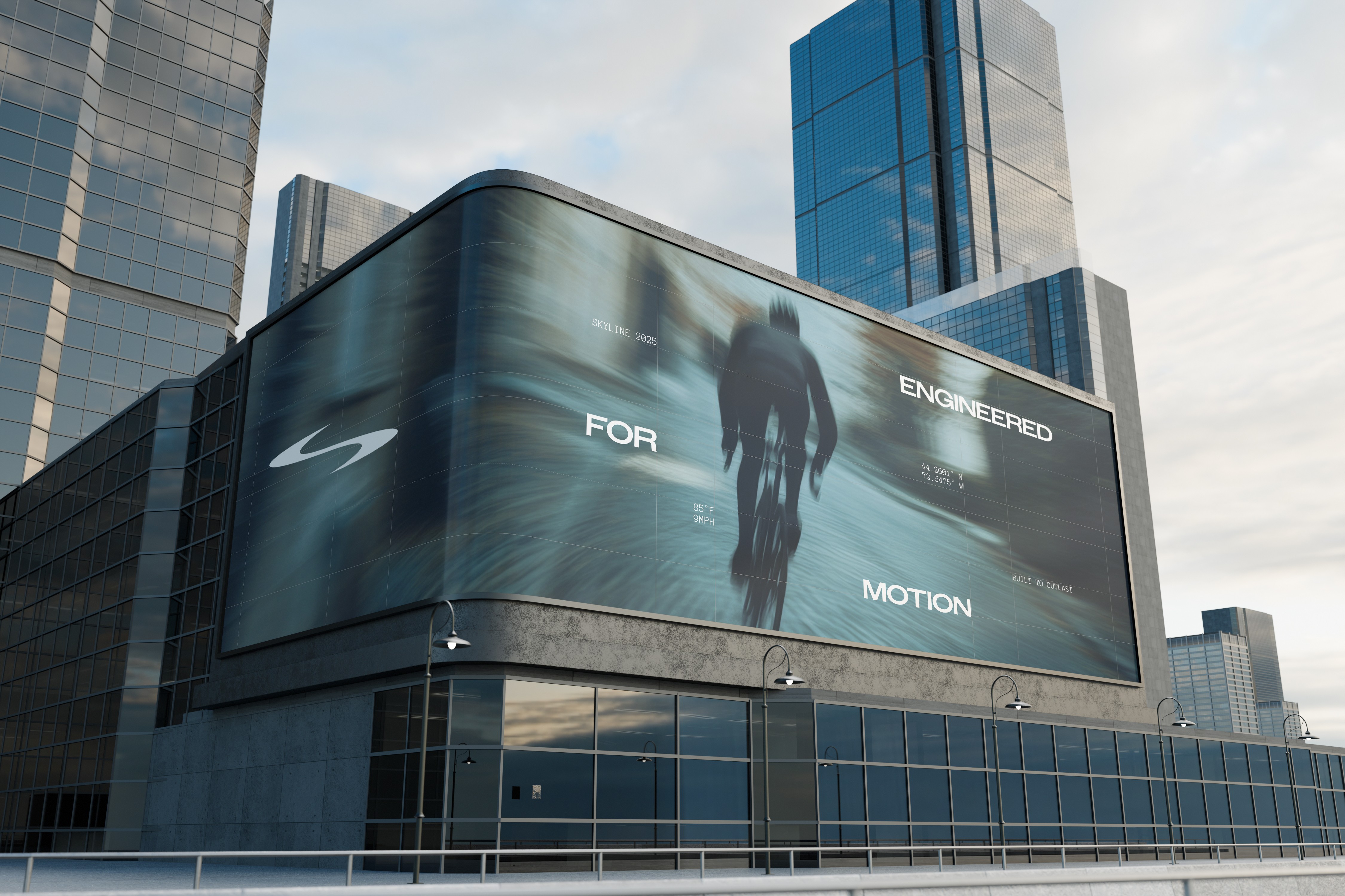
Skyline began as a highly capable OEM drinkware manufacturer producing premium bottles for global brands including Starbucks, Disney and 3CE. We partnered with Skyline to transform that manufacturing strength into a consumer-facing performance brand built for Western markets.
The objective wasn’t simply to create a logo or packaging system, but to position Skyline as a brand capable of competing within Australia’s premium FMCG and lifestyle retail space. The task was to turn a functional product into something people could identify with — a culture-first performance brand shaped for consumers who want to signal an active lifestyle and a more premium sensibility.
Rather than following the category conventions dominating the market, the project focused on giving Skyline a clearer cultural position. Inspired by the discipline, precision and ambition associated with endurance sport, the brand was shaped to feel closer to premium performance brands than traditional drinkware competitors, creating stronger foundations for pricing power, retail expansion and long-term growth.

The Opportunity
Like many Chinese OEM manufacturers, Skyline had spent years building strong production capability, reliable product quality and international manufacturing experience, but without owning the customer relationship or the brand value behind the product. The issue was never the quality of the product itself. It was how the business was perceived in the market.
In categories like FMCG and lifestyle products, consumers rarely choose based on manufacturing capability alone. They choose brands that signal identity, aspiration and cultural relevance. Without a clear brand position, even well-made products quickly become interchangeable on crowded retail shelves. Australia became the starting point for the brand because of its strong outdoor culture, growing fitness awareness and design-conscious consumer base.
Through research and category analysis, it became clear that most drinkware brands were competing through colour ranges, sustainability messaging or generic outdoor aesthetics. Very few occupied the space between performance culture and everyday hydration. That became Skyline’s opportunity.
The Opportunity
Like many Chinese OEM manufacturers, Skyline had spent years building strong production capability, reliable product quality and international manufacturing experience, but without owning the customer relationship or the brand value behind the product. The issue was never the quality of the product itself. It was how the business was perceived in the market.
In categories like FMCG and lifestyle products, consumers rarely choose based on manufacturing capability alone. They choose brands that signal identity, aspiration and cultural relevance. Without a clear brand position, even well-made products quickly become interchangeable on crowded retail shelves. Australia became the starting point for the brand because of its strong outdoor culture, growing fitness awareness and design-conscious consumer base.
Through research and category analysis, it became clear that most drinkware brands were competing through colour ranges, sustainability messaging or generic outdoor aesthetics. Very few occupied the space between performance culture and everyday hydration. That became Skyline’s opportunity.
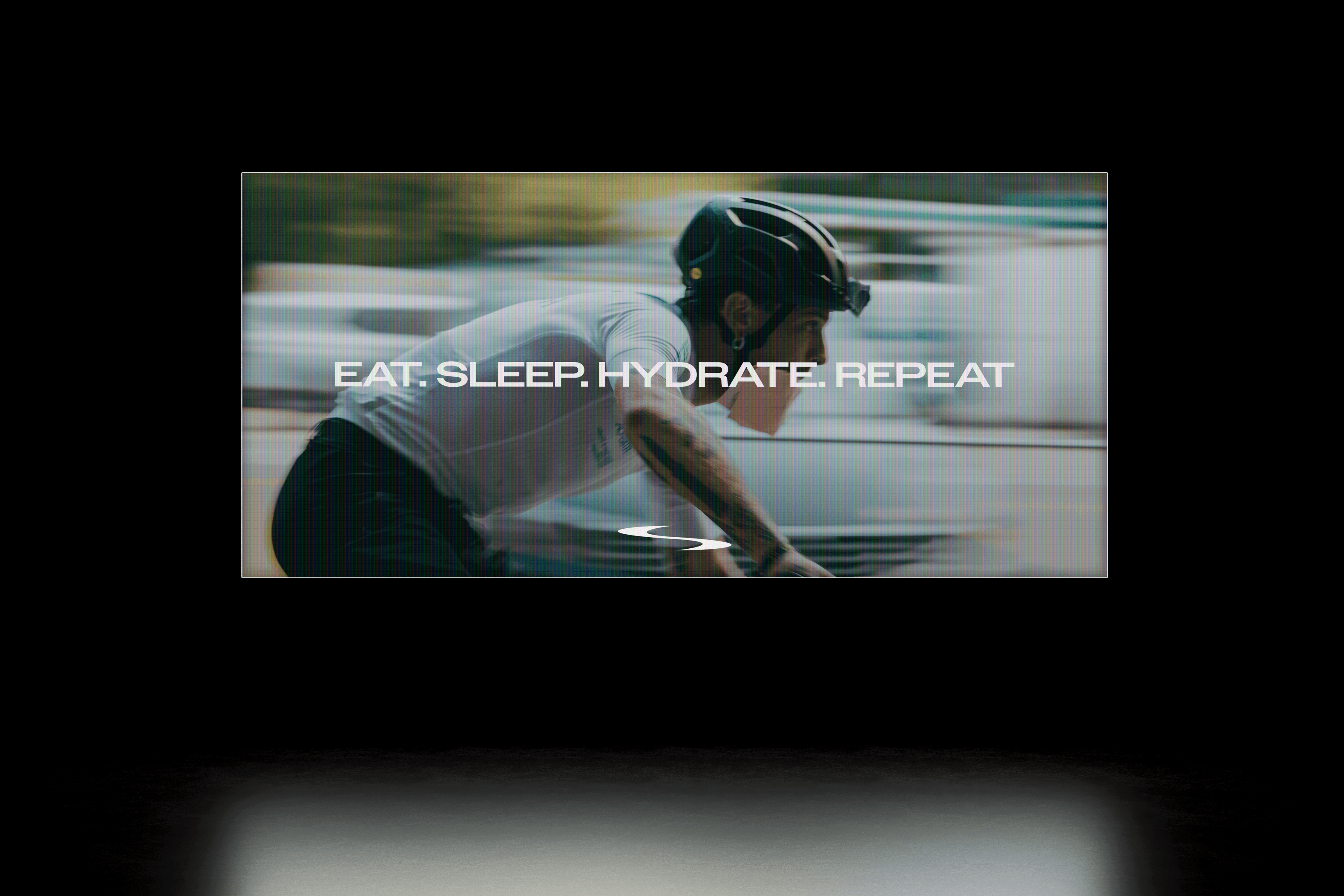
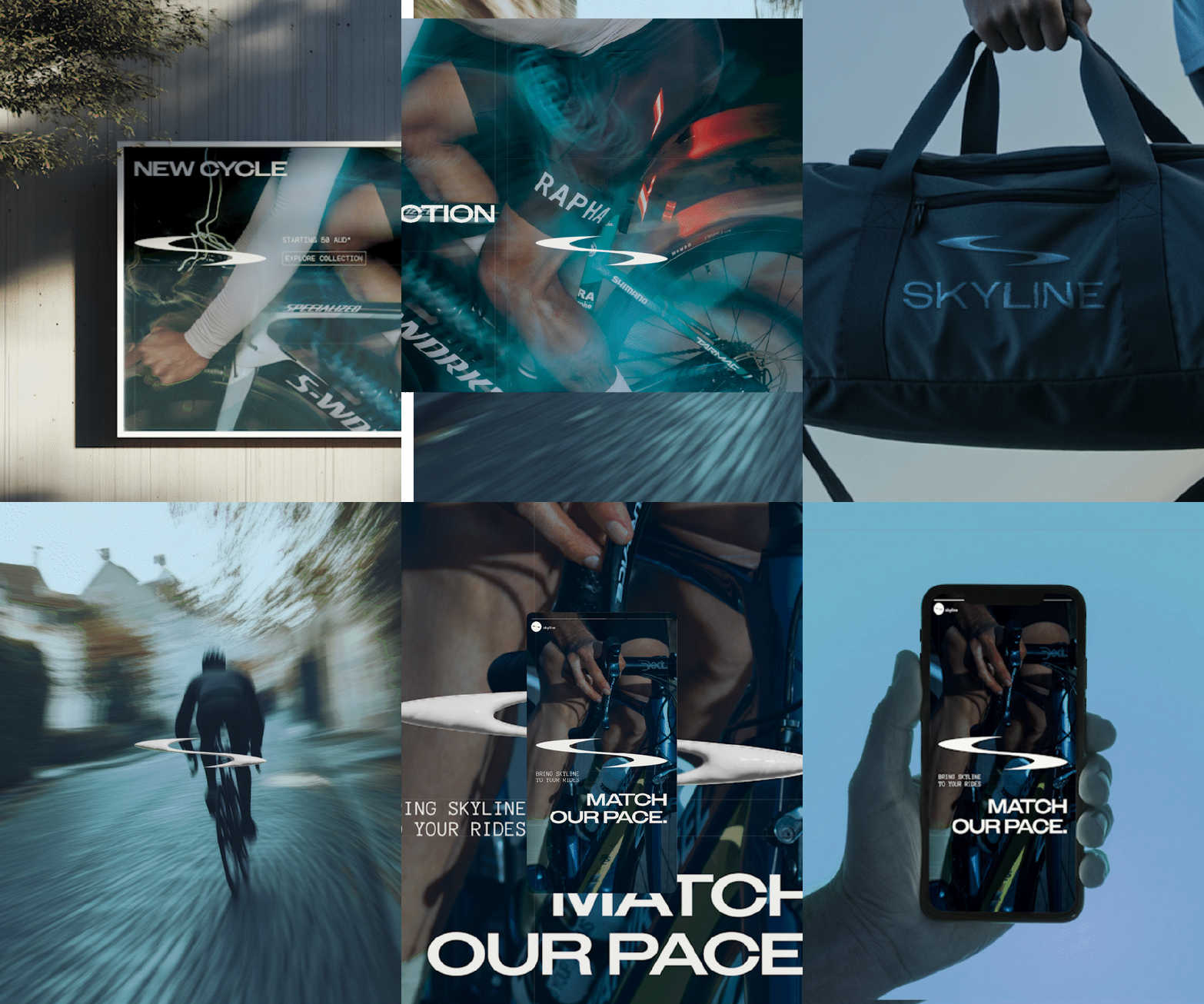
Cycling became the cultural anchor for Skyline. It carries the specific signals the brand needed: discipline, precision, endurance and ambition. Anchoring the brand in that world allowed Skyline to behave more like performance gear than everyday drinkware, creating a clearer position within a crowded FMCG category.
The cycling subculture wasn’t ours to invent. It existed long before Skyline did, with its own ways of telling who rides and who doesn’t, and its own currency among the people who take it seriously. The work was about earning the brand a credible place inside it, so Skyline could become useful to a tribe that already knew its own signals. The cycling reference sits in the brand’s posture and form language rather than in literal cycling symbols, the sport informs the aesthetic standard rather than showing up as explicit, literal representations.
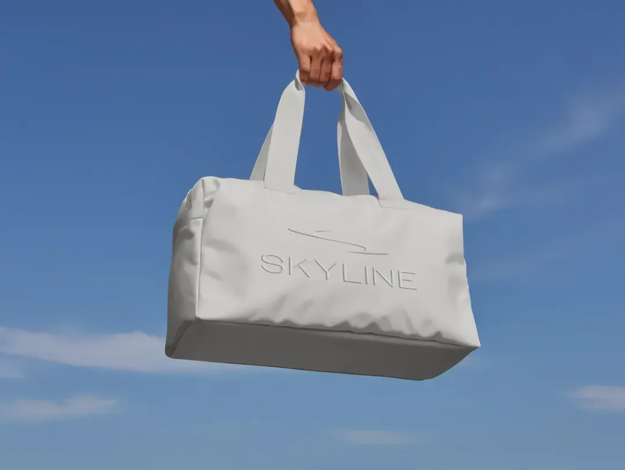
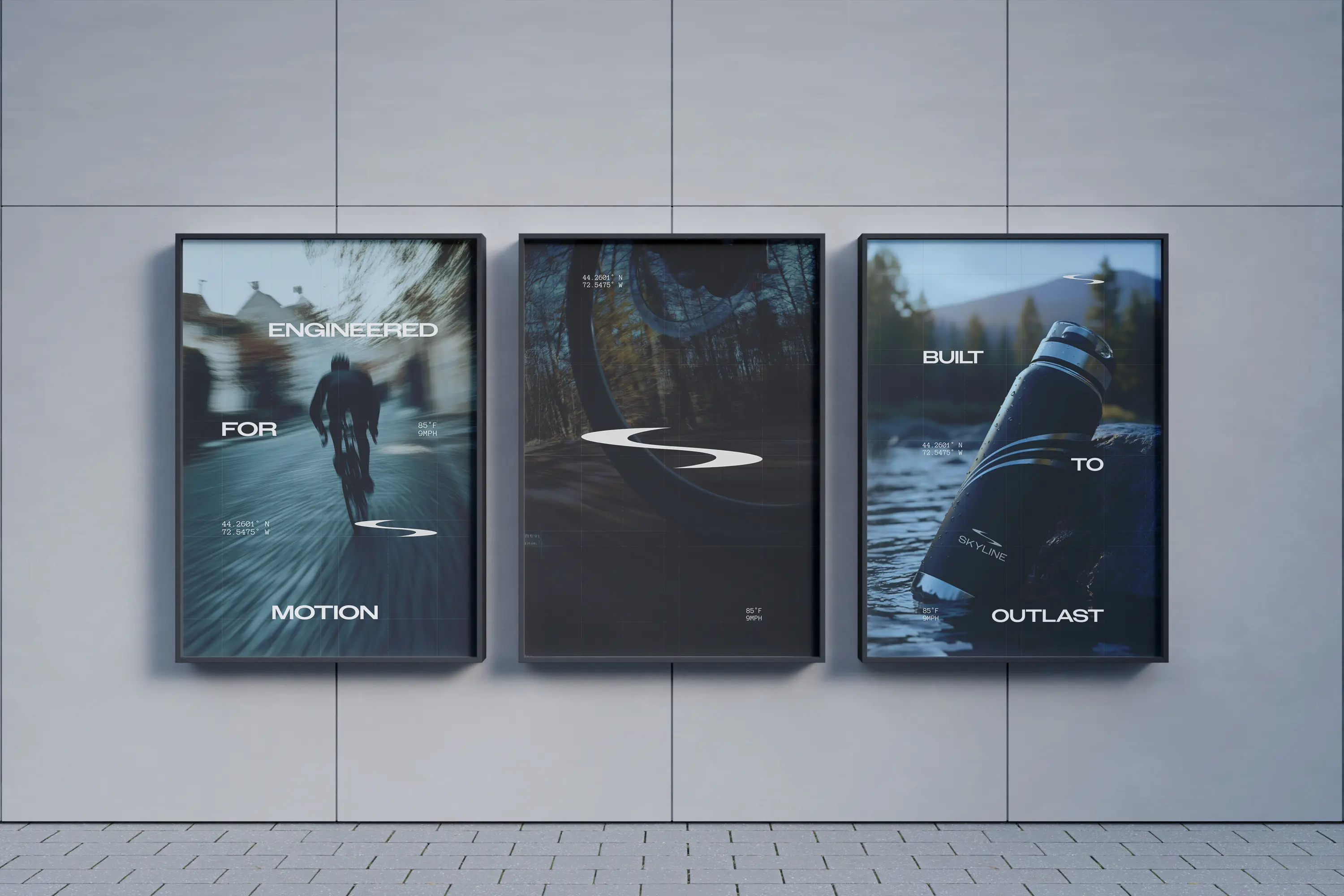
We were conscious throughout that if you put a cyclist on the bottle, you’ve made cycling merchandise. If you let cycling’s visual discipline shape how the brand behaves, you’ve made performance gear that a cyclist would recognise as belonging to their world. That distinction guided everything from photography direction to packaging.
More importantly, the project helped reposition Skyline from a manufacturer producing for other brands into a brand capable of building its own market presence. The new identity gave the business stronger credibility when approaching retailers, gyms, distributors and partnership opportunities across Australia.

The Opportunity
Like many Chinese OEM manufacturers, Skyline had spent years building strong production capability, reliable product quality and international manufacturing experience, but without owning the customer relationship or the brand value behind the product. The issue was never the quality of the product itself. It was how the business was perceived in the market.
In categories like FMCG and lifestyle products, consumers rarely choose based on manufacturing capability alone. They choose brands that signal identity, aspiration and cultural relevance. Without a clear brand position, even well-made products quickly become interchangeable on crowded retail shelves. Australia became the starting point for the brand because of its strong outdoor culture, growing fitness awareness and design-conscious consumer base.
Through research and category analysis, it became clear that most drinkware brands were competing through colour ranges, sustainability messaging or generic outdoor aesthetics. Very few occupied the space between performance culture and everyday hydration. That became Skyline’s opportunity.
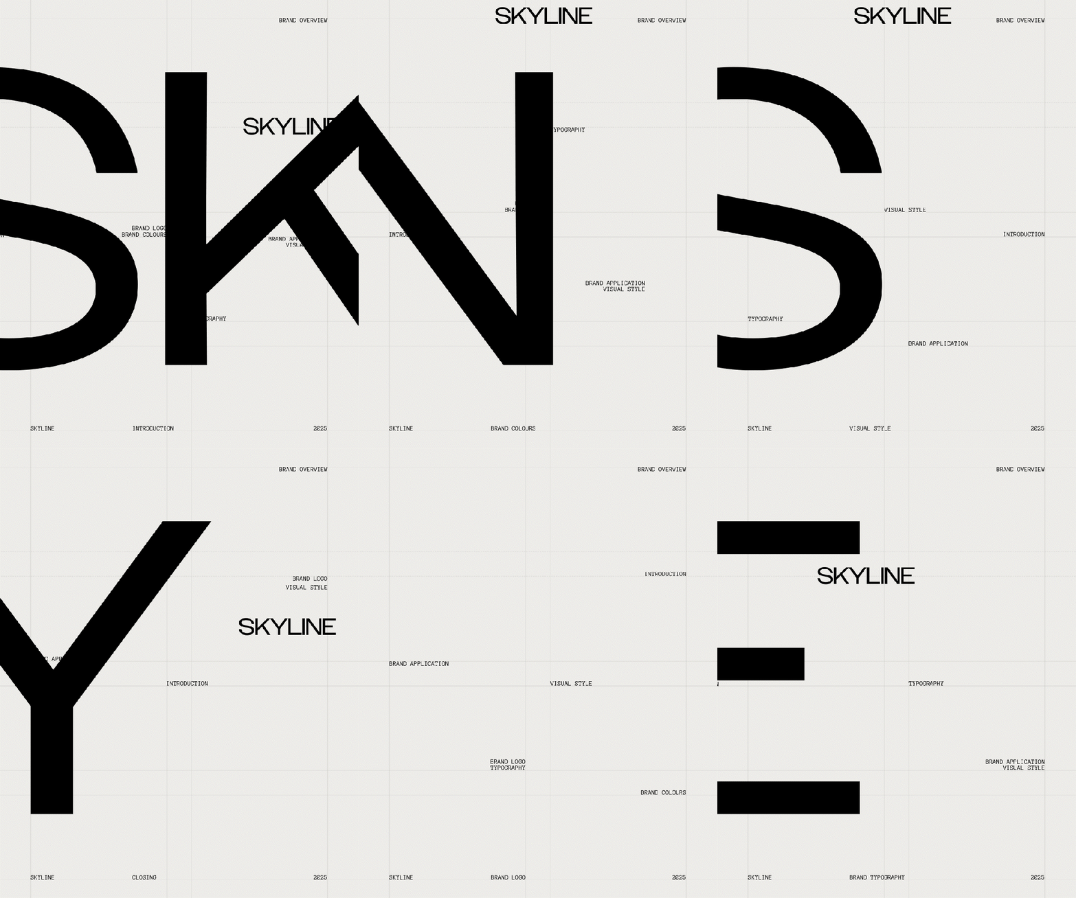
Cycling became the cultural anchor for Skyline. It carries the specific signals the brand needed: discipline, precision, endurance and ambition. Anchoring the brand in that world allowed Skyline to behave more like performance gear than everyday drinkware, creating a clearer position within a crowded FMCG category.
The cycling subculture wasn’t ours to invent. It existed long before Skyline did, with its own ways of telling who rides and who doesn’t, and its own currency among the people who take it seriously. The work was about earning the brand a credible place inside it, so Skyline could become useful to a tribe that already knew its own signals. The cycling reference sits in the brand’s posture and form language rather than in literal cycling symbols, the sport informs the aesthetic standard rather than showing up as explicit, literal representations.
We were conscious throughout that if you put a cyclist on the bottle, you’ve made cycling merchandise. If you let cycling’s visual discipline shape how the brand behaves, you’ve made performance gear that a cyclist would recognise as belonging to their world. That distinction guided everything from photography direction to packaging.
More importantly, the project helped reposition Skyline from a manufacturer producing for other brands into a brand capable of building its own market presence. The new identity gave the business stronger credibility when approaching retailers, gyms, distributors and partnership opportunities across Australia.
More works
More works